
The Challenge
How might we improve people’s first cinemagraph creation experience to increase use, account creation and therefore conversions? Secondly, how might we update the app’s design for the launch of iOS 11 to be featured in the App store and drive app downloads?
Impact
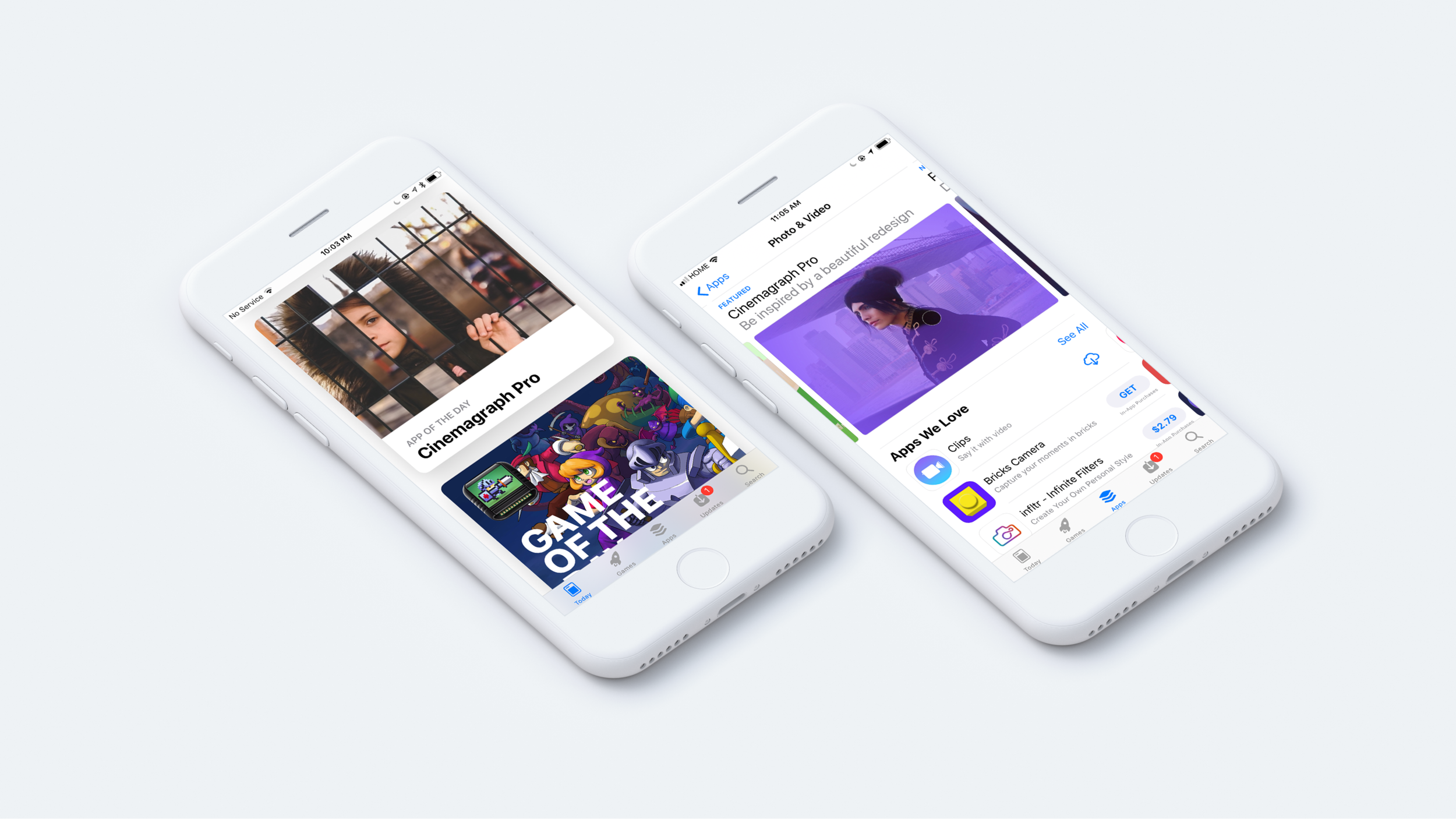
The Apple iOS editorial team chose Cinemagraph Pro as their featured App of the Day in 9 countries: Canada, Great Britain, Italy, Germany, Russia, Australia, France, Brazil and Hong Kong. The new app was also featured prominently in the Photography category in the app store.
250,000 downloads in less than 3 weeks
Redesign increased next day app retention by 45%
New onboarding flow increased user-account creation and email capture by 600%

The Outcome
Our redesign brought auto-playing, auto-looping, cinemagraphs to the home tab of the application to inspire new users, moved tutorials and learning content up in the information hierarchy, simplified the export process and added an educational onboarding flow. Download the app for iOS & macOS

Background
Flixel is an Apple Design Award winning photography software company that makes applications for iOS and macOS. Cinemagraph Pro, the easiest way to make cinemagraphs - a magical composite of photo and video, is our flagship product. These are two cinemagraphs I made, the first in a cafe in Brooklyn, the second a rainy day outside of our office in Toronto.


My Role
I completed the Information Architecture and worked with our lead designer to plan the overall the UX of the iOS app. After we had a structure for the redesign in place, we split the UI design work evenly feature by feature. I completed the high fidelity designs and prototypes for user paths such as export, edit profile, account settings, search for users, purchase, and tutorials. When our other designer left the company just as we were wrapping up the initial design phase, I took on his responsibilities and managed the development process with the engineering team.
Research
Conversation with our power users informed changes to critical path features like share and export. Common requests and feedback through our Customer Success channels helped inform which vital information needed to be clarified in onboarding and the need for new plan options. We also conducted a literature review of best practices and techniques for SaaS onboarding, as well as the iOS Human Interface Guidelines to guide design decisions.
CHALLENGE 1
Onboarding and Education
Cinemagraphs as a medium were only invented in 2012 and their origin and creation process is still fairly mysterious. For this reason, we wanted to create an onboarding flow that quickly educates users on the key steps of shooting and creating a cinemagraph.

When you want to teach something you can a) tell someone what to do b) show them what to do or c) have them do it themselves. It’s widely accepted that people learn best by doing. So, we designed an onboarding path whereby scripting the iOS application and locking certain features we would be able to lead the user through the key cinemagraph making steps: Shoot, Mask, Trim, Pick a still frame, and Loop. However, due to resource restrictions we initially launched with a video version of the onboarding process, thereby b) showing the user how to create a cinemagraph, using text and short soundless video clips.

To increase account creation we decided to present a sign in screen after onboarding. When users create an account they are able to upload to their personal gallery page and be featured in the Flixel galleries. Many photographers are discovered through Flixel and find custom projects and other work this way. In order to not gate the application’s functionality with a sign-in, as per Apple’s Human Interface Guidelines, the create account modal view is dismissible. However, even making create account optional, create an account as the suggested path increased user sign-up by 600%.
Profile Signed-Out and Signed-In State


Moving the Tutorial videos and support content higher up in the information architecture, from the last to the second tab of the app, helped to highlight this educational content. The new tab structure created a user path of Inspire (galleries), Learn (tutorials), Capture (camera), Edit (documents) and Share (your profile).
CHALLENGE 2
Decrease Friction to Export and Share Cinemagraphs
In order to auto-loop and display at its highest quality, a cinemagraph .mp4 file must be a particular number of seconds and resolution for each platform. To simplify this process we created one-tap optimize options for the popular social networks. A user can still custom manipulate a variable like the file format before saving or sharing their cinemagraph.

CHALLENGE 3
Displaying Multiple Purchase Plans
We launched this version of Cinemagraph Pro with three purchase plans, which created the challenge of showing three evenly-weighted options in limited screen real estate, particularly on devices such as the iPhone 5.
To limit the complexity of evaluating three detailed options we used progressive disclosure. A fun interaction, tap to expand with a bounce animation, allowed users to explore further what comes in each plan, as well as make their purchase.

Low-Fi Interaction Prototype for Development


Conclusions & Learnings
Working with a team of senior iOS app developers and another designer for part of the project was a great way to learn about the many conventions of iOS. I significantly deepened my knowledge of iOS design principles and Swift app development over this period.
The product is always a work in progress, and there are further improvements I think could be made. Particularly, I still think the application could benefit from having a more interactive onboarding experience. By building out the scripted cinemagraph creation walkthrough people would be able to ‘learn by doing’ and would gain a deeper understanding of the process. Although the plans view was improved with new UI and interactions, optimising the entire purchase path was not in scope for this redesign. I think this an area we could focus more time to reduce friction and see a direct impact on subscription revenue.

ONBOARDING & WELCOME WINDOW ON MACOS
We designed and implemented a very similar onboarding flow on macOS to increase account creation and give context on launch of the app. During this process I also redesigned the mac apps Welcome Window.
The goal of the redesign was to create a window that would act as a launchpad, pointing users at different stages of the user journey to different actions (as seen on the left-hand side). This list of topics was dynamically designed to display options based on the user’s state; signed-in, signed-out, free trial versus paid plan. If the user was a paying customer the sidebar would fill with actions associated with strong customer health such as uploading to one’s gallery or participating in the Flixel forums. If running a trial the actions would suggest booking a one-on-one demo and other user actions statistically tied to conversion.
The right side of the window toggles between previews of the users most recent documents and tutorial videos. By adding tutorials into the mac app we created an integrated learning experience where users could watch tutorials and create their first cinemagraph by following along with the demonstrations documents all from within the application.
CINEMAGRAPH PRO FOR IOS PRODUCT PAGE
During my time at Flixel we also fully redesigned the company’s website Flixel.com, this is the product webpage I designed for the iOS application.

DIGITAL ADS
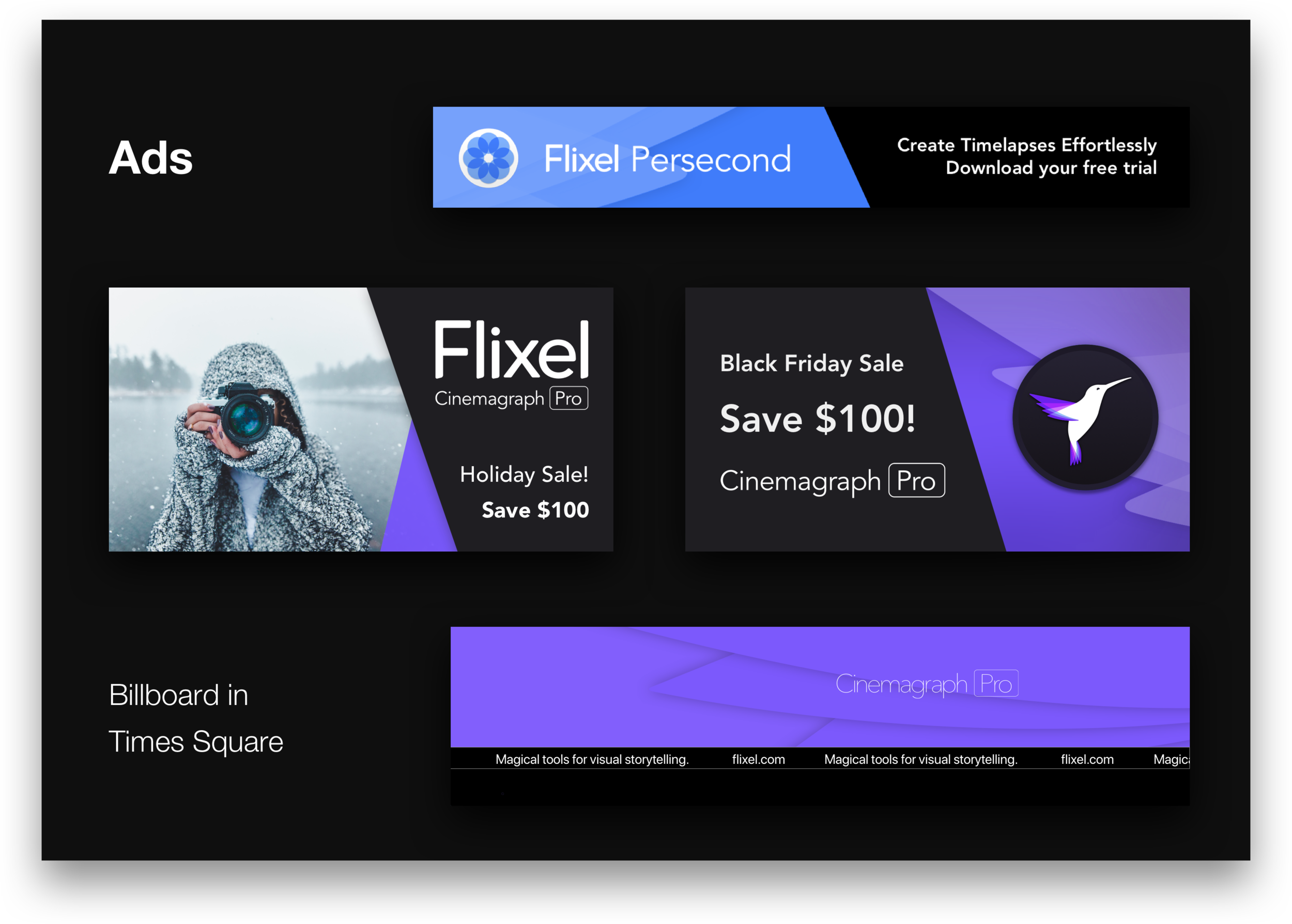
In 2016 I designed Flixel advertisements for Facebook, the Flixel Blog, the Google Display Network and a Times Square billboard!
2018 DESIGN TRENDS FACEBOOK LIVE
Live from Flixel Photos
The Flixel marketing team regularly makes Facebook live videos for our content marketing funnel. In January, I did a quick informal presentation on the Design Trends for 2018, featuring cinemagraphs (of course). The goal of the video was to help our community of marketers and photographers get caught up on the design trends for the new year as well as help them understand where they could use their cinemagraphs.